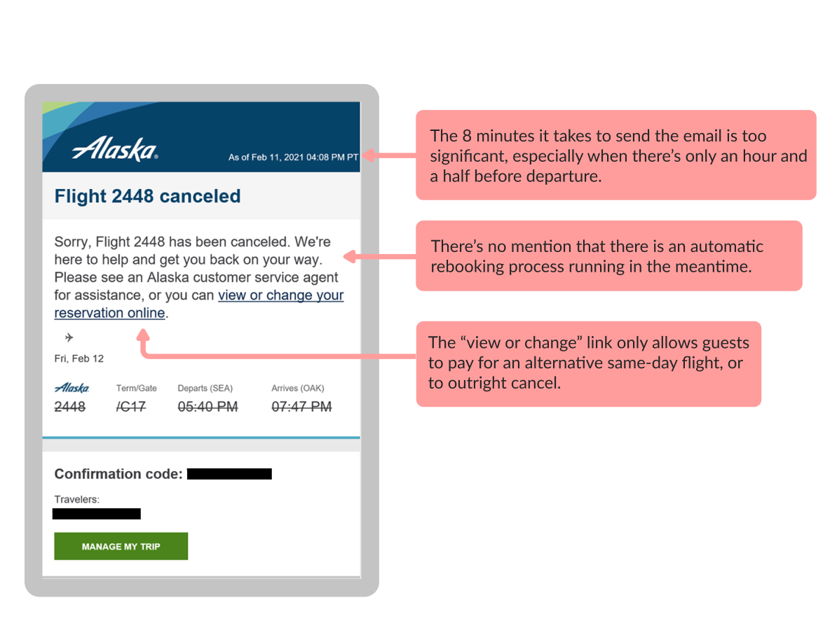
User Testing
For our initial test, we ran a moderated study through UserTesting.com. We looked for ten testers that fly at least 2-3 times a year and have recently experienced a flight cancelation. Here are a just few of our many key learnings:
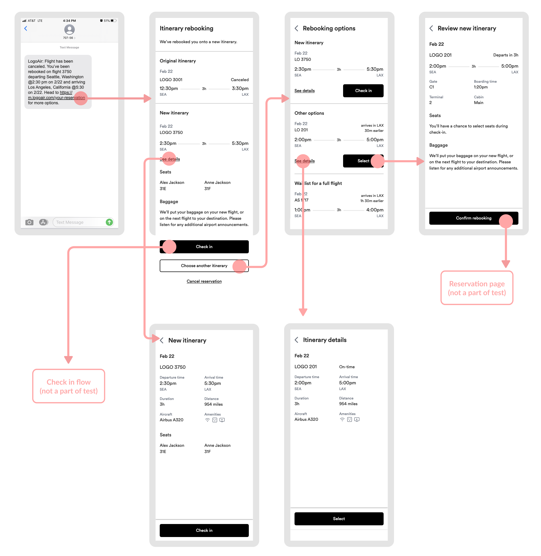
- After selecting a rebooking, 7/10 participants expected to see the seatmap and be able to choose seats.
- The core flow matched our testers' expectations. 7/10 participants correctly expected to see rebooking information after clicking on the SMS link, and 8/10 fully understood the different ways to proceed (check in, rebook, or cancel trip)
- 4/10 testers initially thought that "arrives in LAX 30 min earlier" meant that the flight could arrive early as opposed to arrive 30 minutes earlier than their current flight. Additionally, some participants were confused by the inclusion of flight on-time data in the flight details page.
- 4 participants wanted to see more information about seating and 3 participants wanted to see more about bags.
It was still early, but the first impressions were very promising. We asked our guests to rate the experience in terms of how clear it was to them, their level of confidence when going through it, and their satisfaction overall.
- Clarity: 4.25 / 5
"It seems really user-friendly, like I couldn’t screw it up. I felt like I had some control and flexibility but I wasn’t going to screw it up." - Confidence: 4.8 / 5
"It feels very empowering. When our flight was canceled, people were lining up, people were calling…it was like lord of the flies. I really like how empowering this is where I can make these decisions and not have to go through other people." - Satisfaction: 4.5 / 5
"Anything where you don’t have to sit online and wait to talk to somebody and you can do it at your fingertips and do it that easily is definitely making it easier and more efficient."
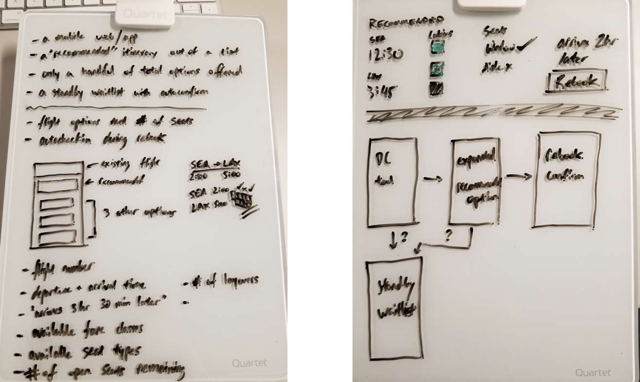
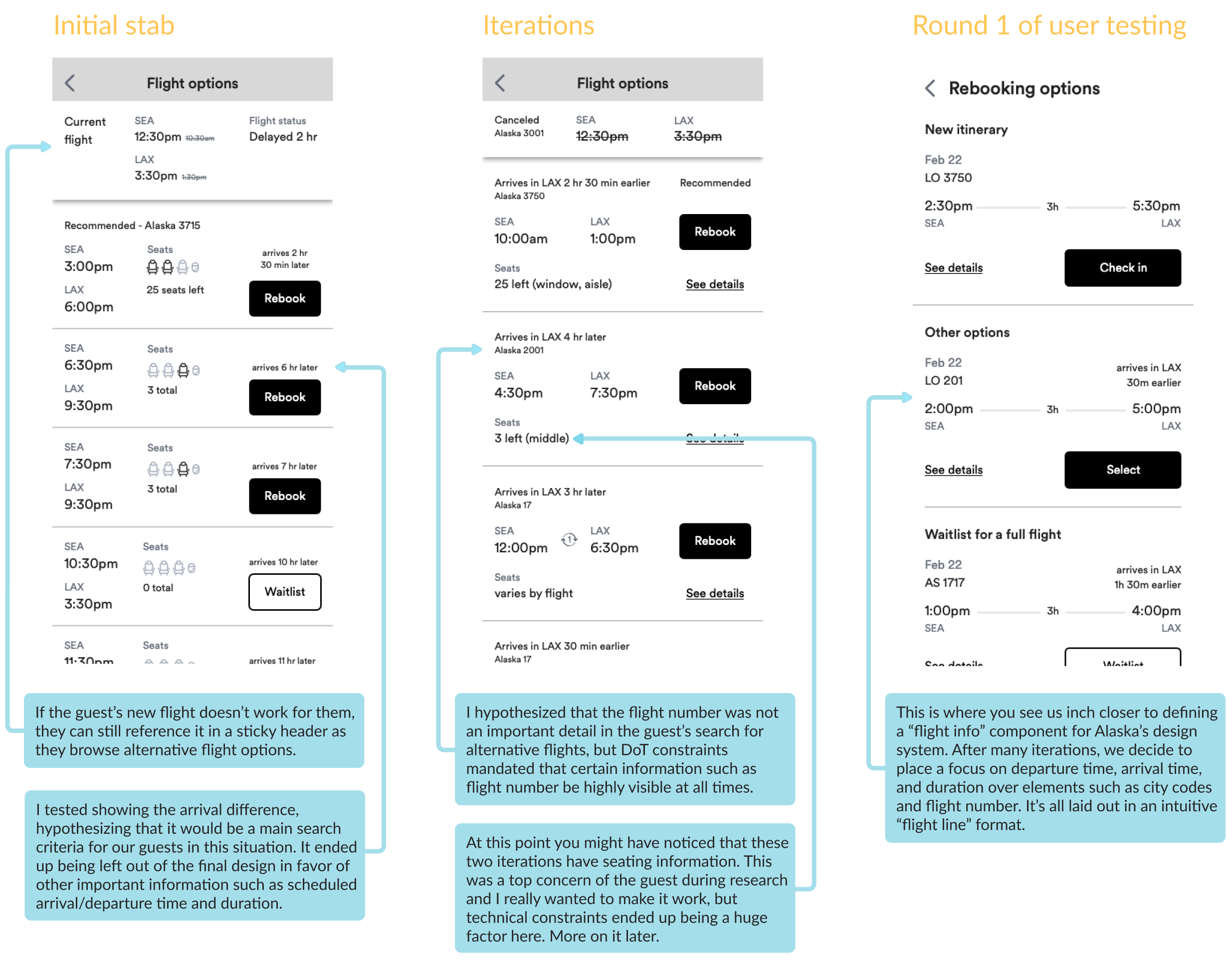
From this point, I made the following improvements:
- I added a baggage section to the landing page as well as the rebooking review screen. This way, guests would be aware of what's happening to their baggage regardless of if they pick a new itinerary or not. Unfortunately, there’s not a lot we can promise them in this case due to airport operational constraints, but the transparent communication goes a long way to keep our guests’ faith.
- To add more information about seating, I added a section showing the guests' new seat assignments directly below their new itinerary.
- Testers loved seeing the ability to choose a new itinerary, but it was hidden too far down the page. I resolved this by putting the "Check in" and "Choose a new itinerary" buttons in a sticky footer so guests would always know what their options are.
- I continued to refine the flight information component and flight details page. At this point, a fellow designer began redesigning Alaska's flight search experience, and from here on out we partnered regularly to ensure our flight information designs remained consistent.
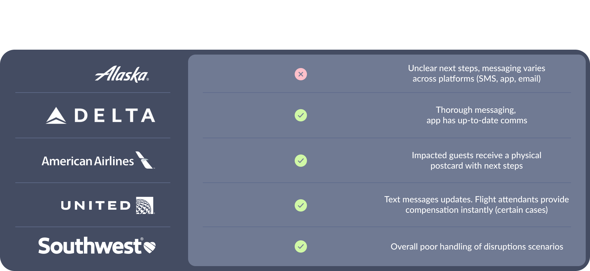
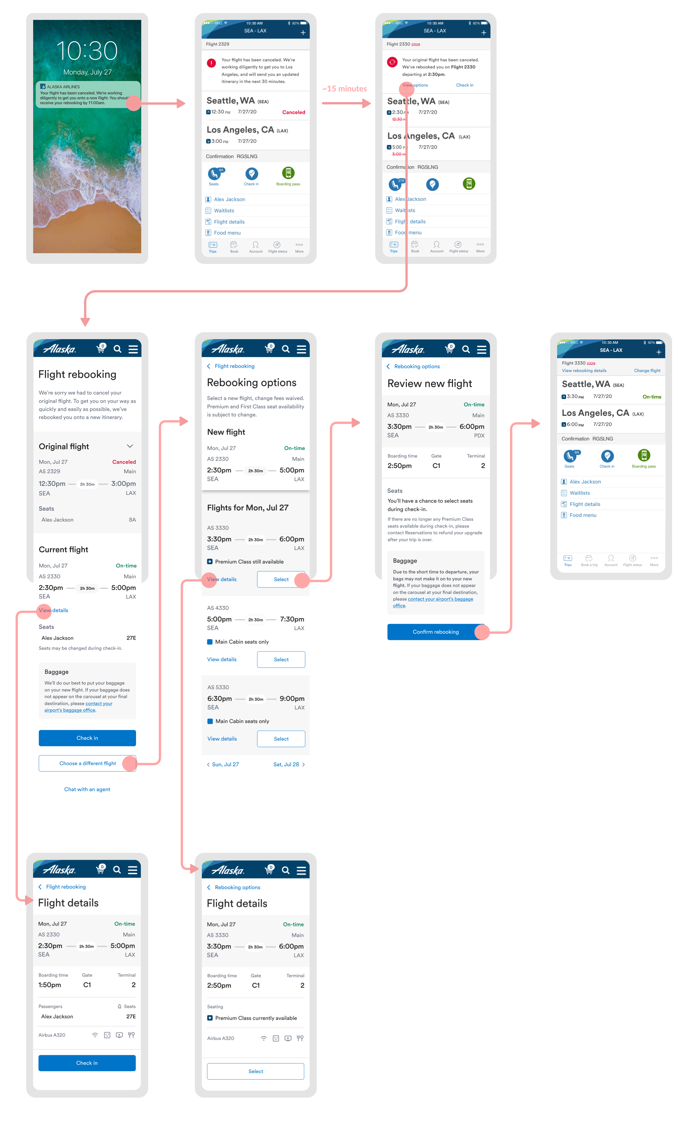
After several rounds of unmoderated testing and polishing UI, we were ready for our biggest test yet. At Alaska, we are always sure to test with our elites– our frequent flyers, guests with mileage plan status with Alaska Airlines. For this prototype, we tested the app entrypoint (as opposed to SMS in the previous prototype.) The app notification would be able to reach our guests ~8 minutes faster than our usual email.
We interviewed six elites who flew a variety of business and leisure travel. Since they were such frequent travelers, all had at least one painful disruptions experience. Together, they voiced the following feedback:
- Gate information is not visible enough
"If i’m currently waiting in Gate B4 and it’s in…whatever different concourse there is, it’d be nice to know that." –Keith - The guest's original seat on their original flight should be shown
"I don’t see my original seats…so if I went from row 4 to row 31 I would be unhappy. If I went from row 29 to 31 I wouldn’t care." –Michael - Guests should be automatically checked-in to their new itinerary
"I’m surprised at the bottom that it says check-in, just because I assume that I would already be checked in." –Chuck - One of our elites' main perks is to be automatically waitlisted for free upgrades into premium and first class. However, this was not reflected anywhere in the disruptions prototype
"As an MVP Gold I always want to know if I’m being waitlisted (for an upgrade) on the next flight. If the flight’s transferred, do I need to put myself on the new waitlist?" –Shawna
Overall, our elite testers gave incredibly positive feedback on the concept, the prototype, and they were very excited to see this concept start to become a reality.
- Clarity rating: 4.8/5
"It had what was needed in that moment, it wasn’t cluttered, I think the action steps were pretty clear. information if I needed it was on other screens so I wouldn’t necessary get overwhelmed." – Chuck - Confidence rating: 4.3/5
"Super confident. I like the ability to accept the flight right away or look at other options." – Shawna - Satisfaction rating: 4.25/5
"From the standpoint of 'stuck there, need to see options to get out of there', it provided everything I need." – Craig