SAMSUNG – CHECKOUT REDESIGN

Designing a flexible and scalable checkout

/Product Design     /Responsive Design 

Overview

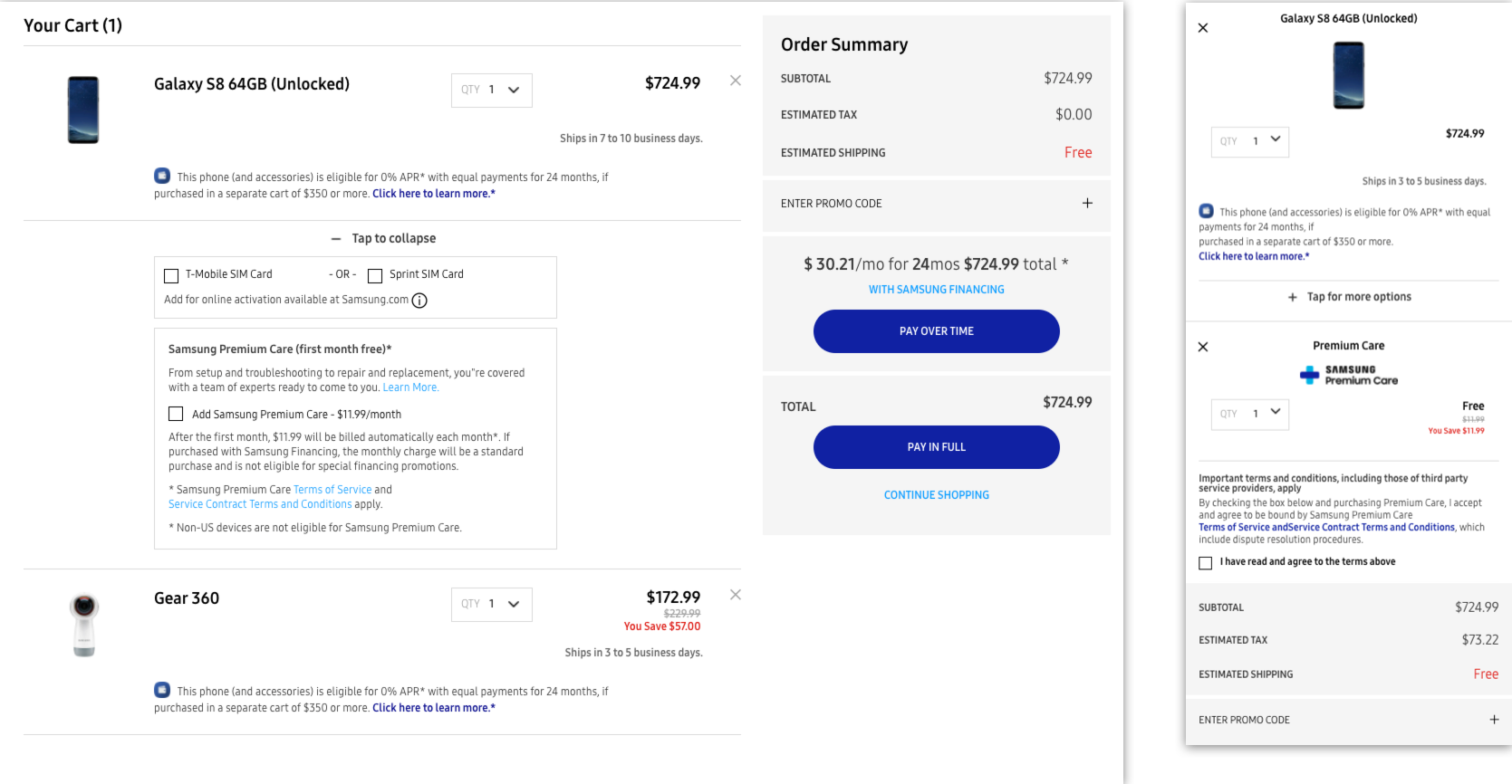
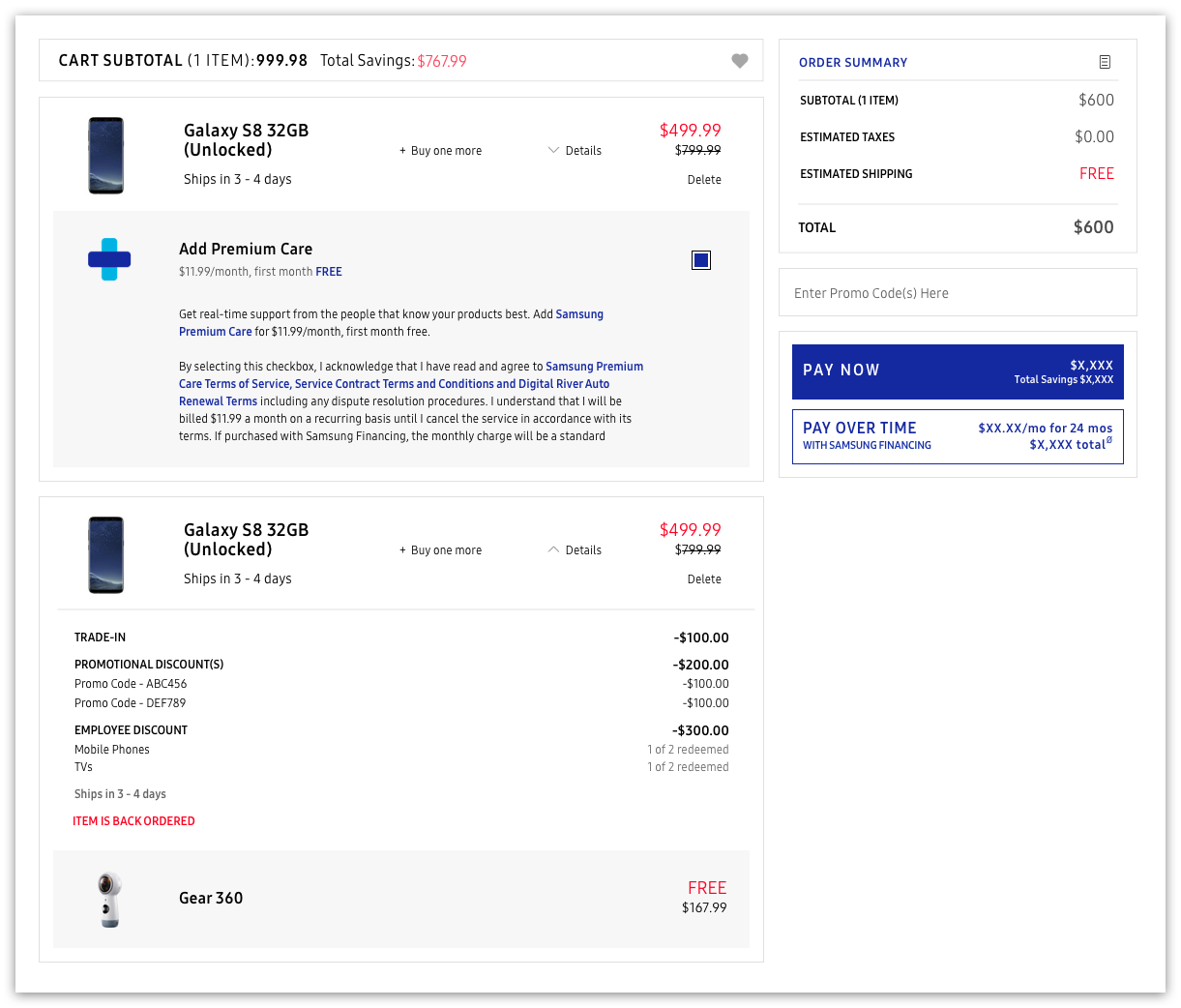
Samsung's old cart and checkout experience had a hard time converting customers, and it wasn't difficult to see why. Aside from the outdated feel, the overall experience completely buckled when handling multiple line items and add-ons.

For example, if a user's cart held multiple parent items (such as Galaxy S8s) and multiple child items (such as Premium Care coverage or a bundle deal), there was no easy way to distinguish which child item belonged to which parent. As a business that is constantly pushing out BOGOs and special programs across all product families, Samsung needed a solution built to handle complex orders. This
demand for flexibility and clarity laid the foundation for our redesign.

TIMELINE 
TEAM
ROLE
TOOLS 

2018
Ecommerce
Product Designer
Sketch

Cart: before redesign

Desktop:


Mobile:

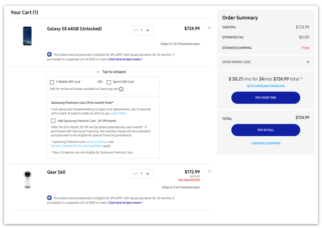
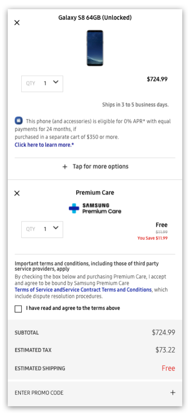
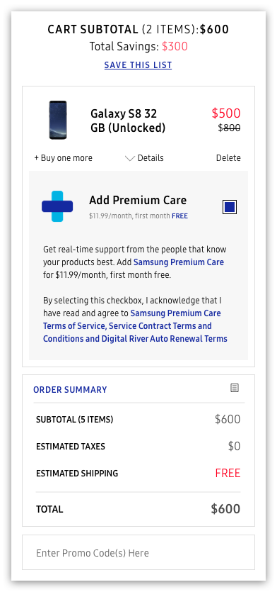
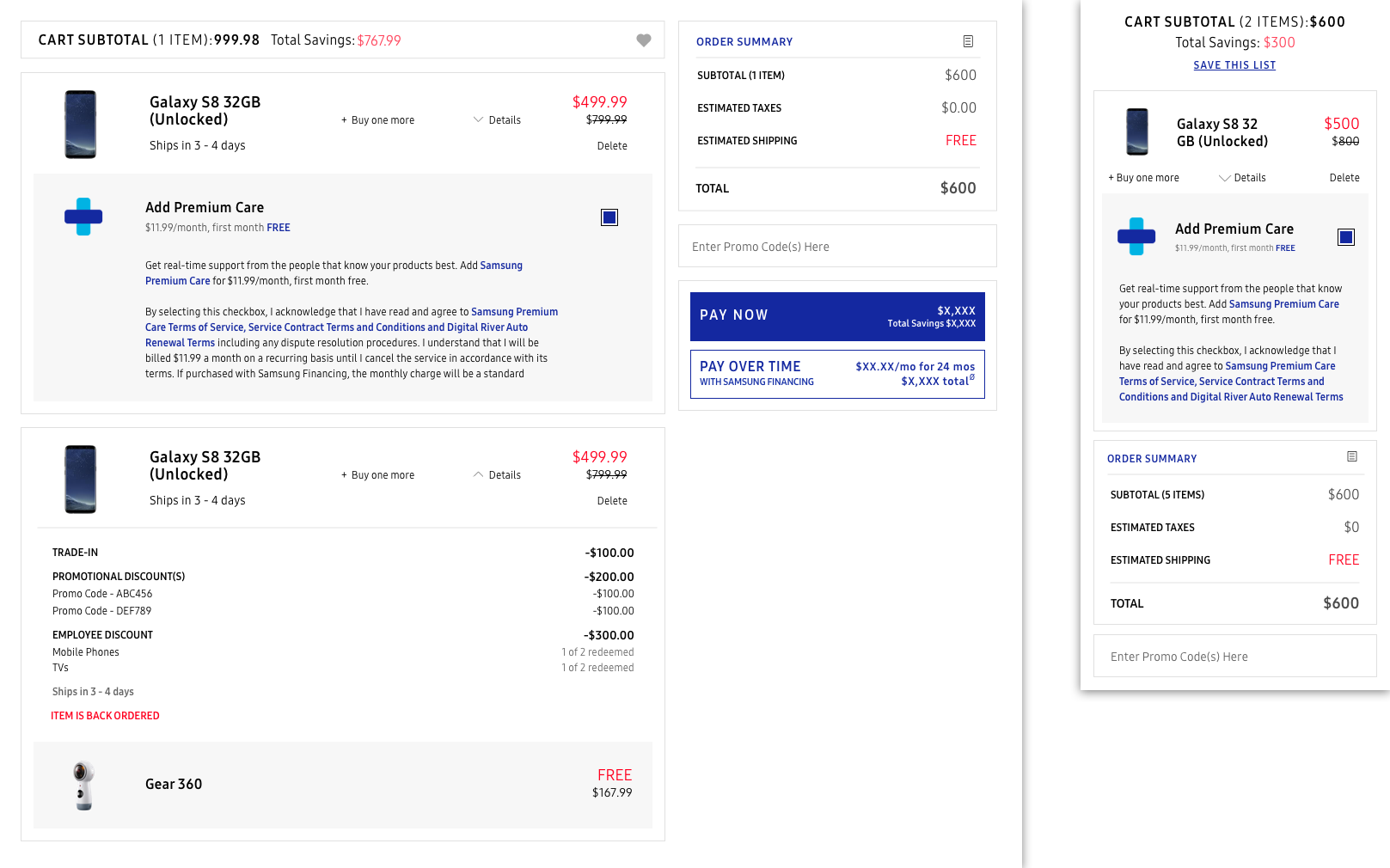
Cart: after redesign

Desktop:


Mobile:


Our first step towards flexibility was atomizing the old design. By breaking down the cart and summary sections and painting them in a unified style, we created a modular design that could break down even the most complex orders. Clarity, on the other hand, meant delineating the relationship between parent and child items. It also compelled us to add an expandable details section that made sure customers knew exactly what they were paying for.

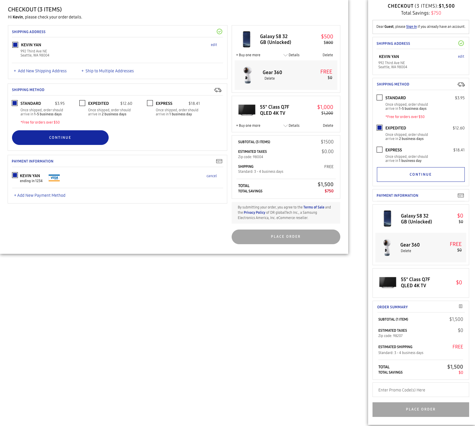
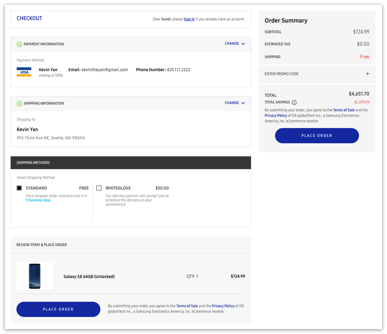
Checkout: before redesign

Desktop:


Mobile:


Whereas the cart was more modular in design, we wanted the checkout to be more modular in logic. We opted to break the flow into chunks (address, shipping, payment) and present them one at a time on the left-hand side. By moving the item summary to the right-hand side and axing the extra "place order", we were able to cleanly organize functionality without sacrificing visibility. This contributed greatly to the clarity of the experience. This structure also translated well to mobile; each time customers completed a step, it would close and the next step would automatically scroll into view. Throughout the process, we were sure to be visually consistent with our design decisions from the cart redesign.

Carrier activation: a stress test

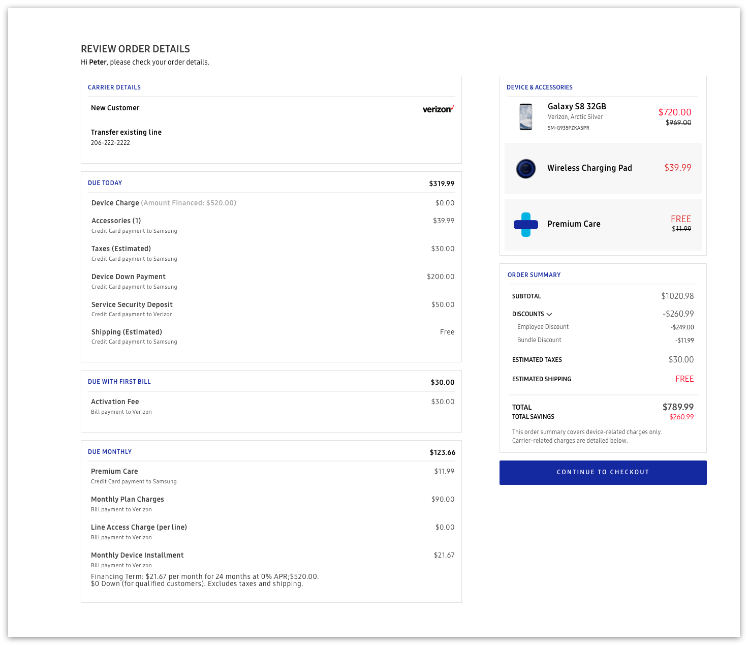
Our foresight paid off several months later. When Samsung launched a program to allow customers to activate their new Galaxy devices through Samsung.com, we exposed the checkout to several huge design demands. These issues included bills due at time of payment, bills due after the first week, monthly bills, down payments, and legal agreements. It was a real stress test that would determine just how adaptable our solution could be.

Carrier activation: cart

Desktop:
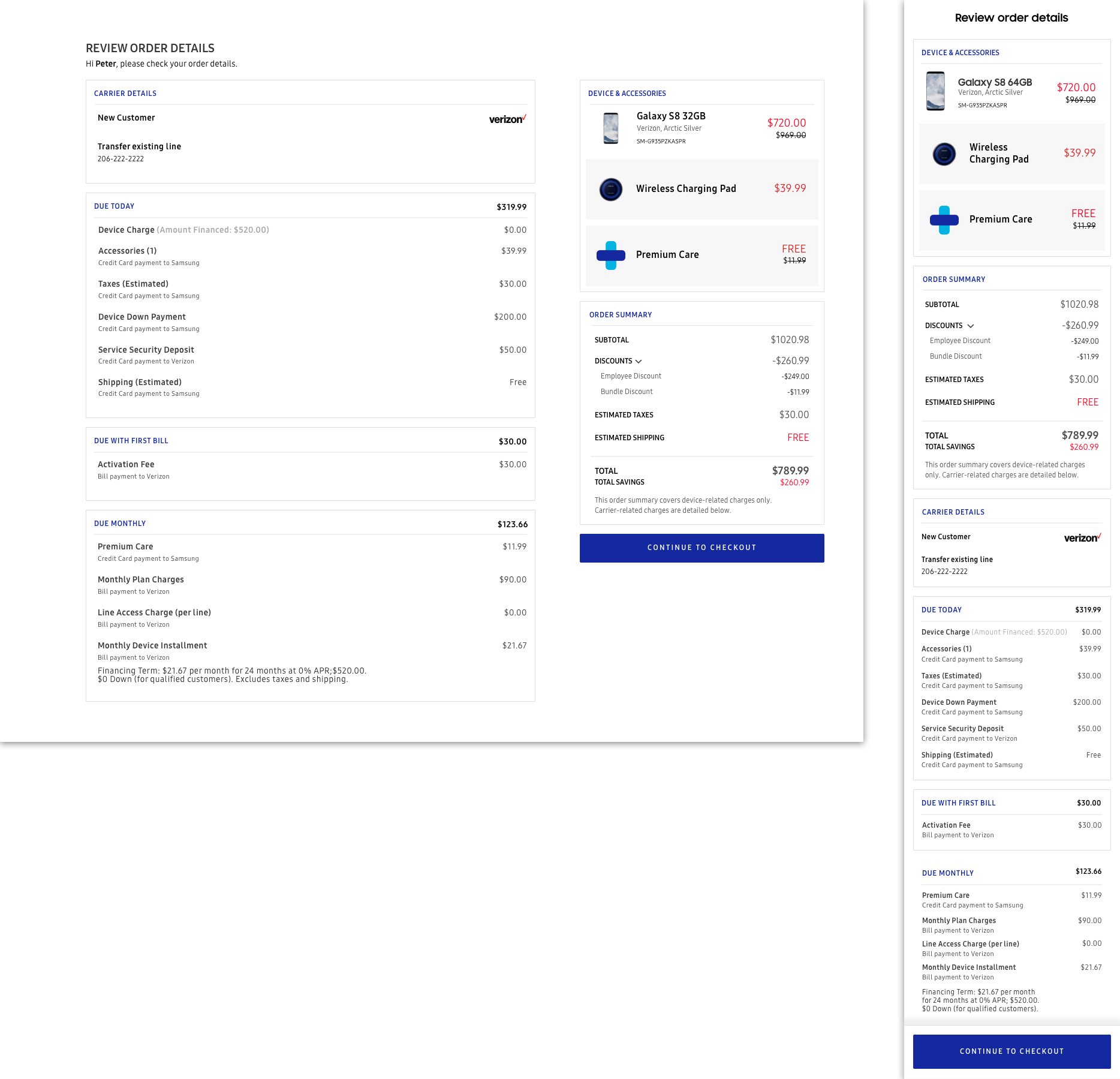

Mobile:


Upgrading to a new phone is often a deals-driven decision, and many of our users prefer to pay in installments. Consequently, my goal was to again communicate the pricing as transparently as possible. When brainstorming the best way to handle the three-headed payment plan, our team concluded that the cart would need to contain a payment summary and thus become more of a review page. The design's modularity allowed us to move the products to the right-hand side without breaking the logical flow, as already done in checkout. We elected to use the main space to clearly delineate the bill payments. By handling the payment summary on this page, we lessened the overall user burden that was to come in the checkout.

Carrier activation: checkout

Desktop:
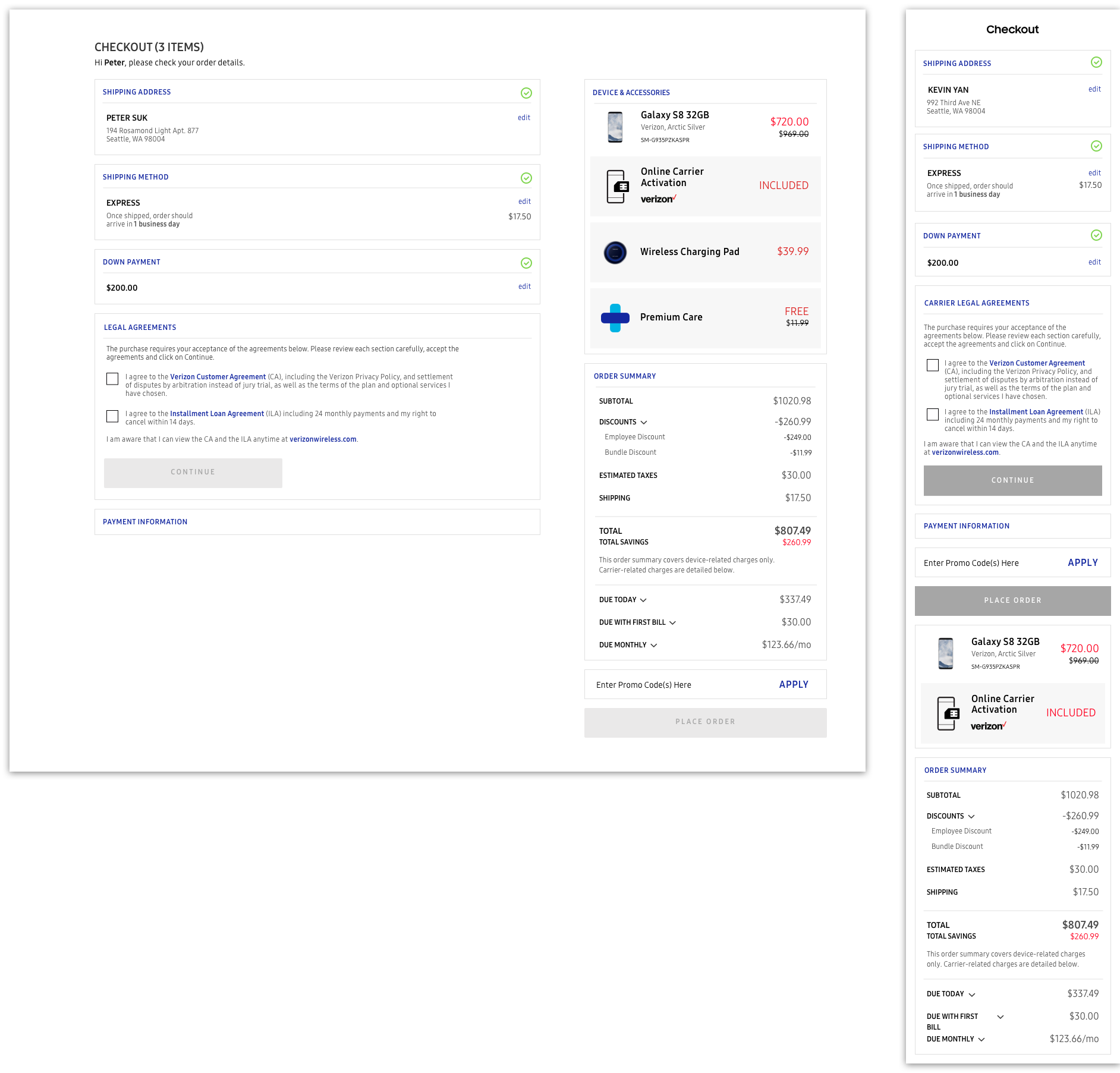


The redesigned checkout handled the carrier activation with no issue, demonstrating the flexibility that we prioritized so much during inception. The new down payment and legal agreement sections fit right into the page as new modules, keeping the flow easily digestible from end to end. The three bills are slotted in right beneath the total price; even though we handled the bill summary on the previous page, the down payment can affect the pricing and users are still expected to confirm their spending all the way up until purchase.
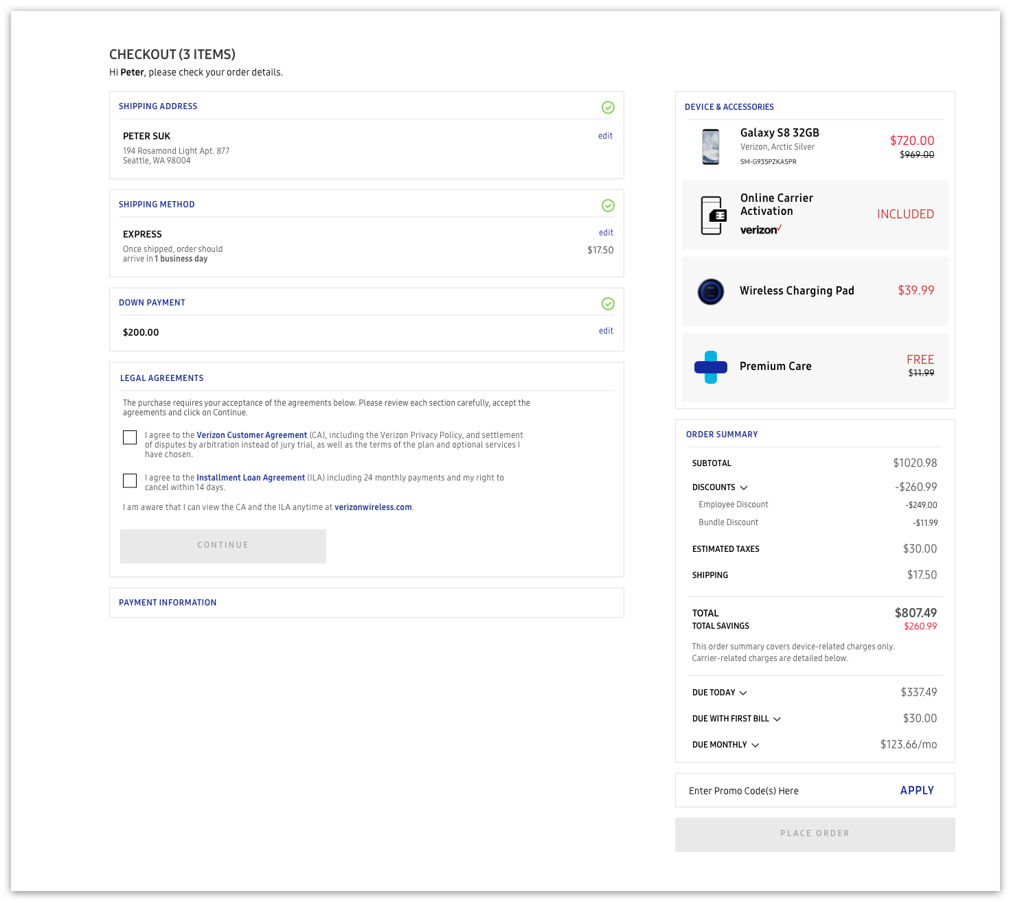

Mobile:

Looking Back

There are a few improvements I would have liked to explore. Despite our best attempts at mitigation, the checkout process can get very lengthy on mobile. Ideally, we would have been able to design a few different UIs and conducted user testing. Purchasing a product should be an exciting moment for our users, as they're spending their hard earned money on what is most likely a very expensive electronic. I believe that we could have done more to capitalize on this and engage the user in our design.

I always enjoy redesign projects because of the opportunity to turn pain points into strengths. This particular project reinforced the value of identifying a few key values and referring back to them repeatedly to ensure they are upheld. Additionally, our ability to think ahead during the initial redesign process saved us countless hours during carrier activation, a project with immediate deadlines and heavy time crunches. The ability to solve past, present and future problems in one solution is a skill I will bring to all projects down the road.

Credits