User Testing
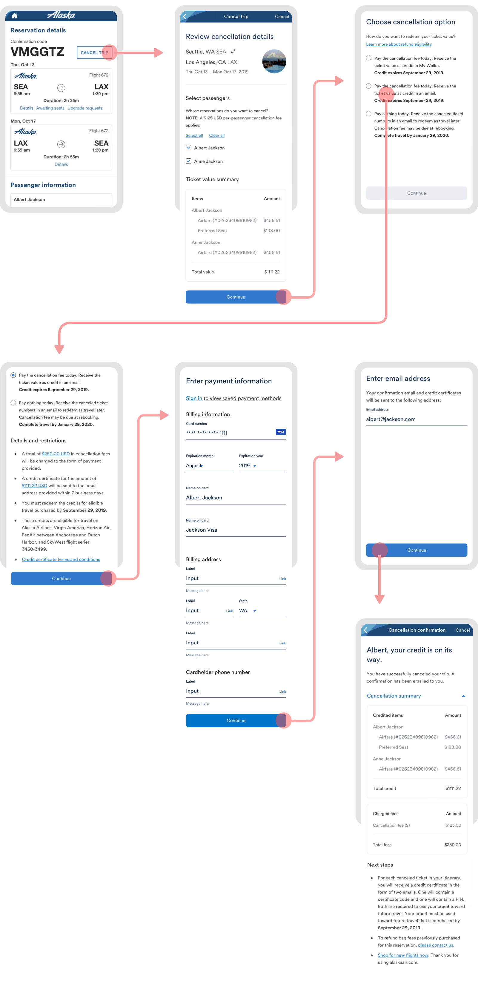
With our first rounds of iterations done, we took it out for user testing. Our overall research goals were to gather initial feedback on the understandability of our reworked copy, as well as test the usability of cancels on a mobile platform. Here's our initial prototype:

As before, we tested with 5 recent cancelers and 5 participants who had not canceled recently.
- 10/10 participants noticed early on that there would be a per-passenger cancellation fee.
- 9/10 participants did not notice a difference between the "book by" and "travel by" dates.
- 4/10 participants initially expected a full refund instead of just travel credit.
- 4/10 participants felt that all three options were too similar and underwhelming overall.
- 4/10 participants were confused on what My Wallet is.
- Overall, participants understood the accordion concept. 0 participants expressed accidentally clicked or expressed confusion about the collapsed sections.
Participants that had canceled recently:
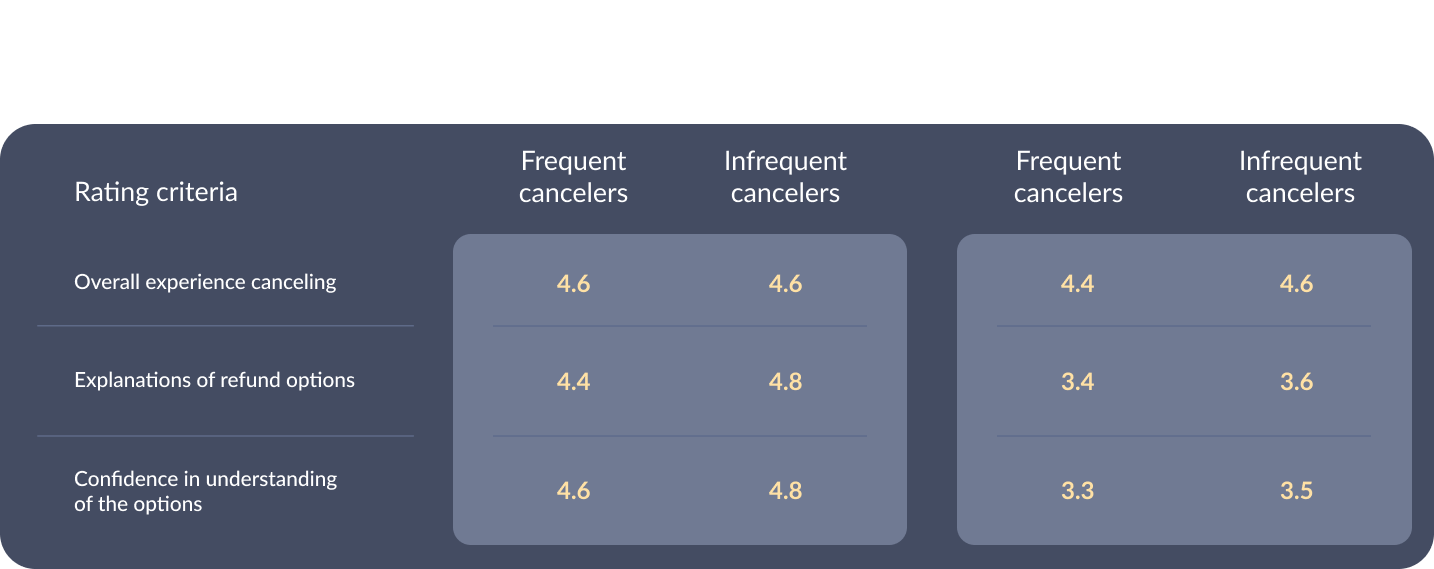
- Overall experience canceling: 4.4 / 5
"It was easy to cancel the flight, it was just clicking 'cancel' and then completing the steps." - Refund option explanations: 3.4 / 5
"Oh this wasn't clear, I thought I was getting an actual refund." - Confidence in their understanding of the options: 3.3 / 5
"I'm confident that I completed the task, but not confident that the option I chose was the best one for me."
Participants that had not canceled recently:
- Overall experience canceling: 4.6 / 5
"Every page let me know why and what was going to happen." - Refund option explanations: 3.6 / 5
"The third option was a bit more confusing, did not understand it 100%." - Confidence in their understanding of the options: 3.5 / 5
"I understand what's happening and how it works, but I was confused."
Here's the rating scale data, with the original experience and the first prototype side-by-side:

So...a little discouraging. Although the overall experience rated at about the same level, this first prototype rated over a full point lower than the original experience in terms of the refund option explanations and the participants' confidence in their understanding of the options. Was our condensed copy that much more confusing? Was it related to the difference between testing on desktop vs mobile?
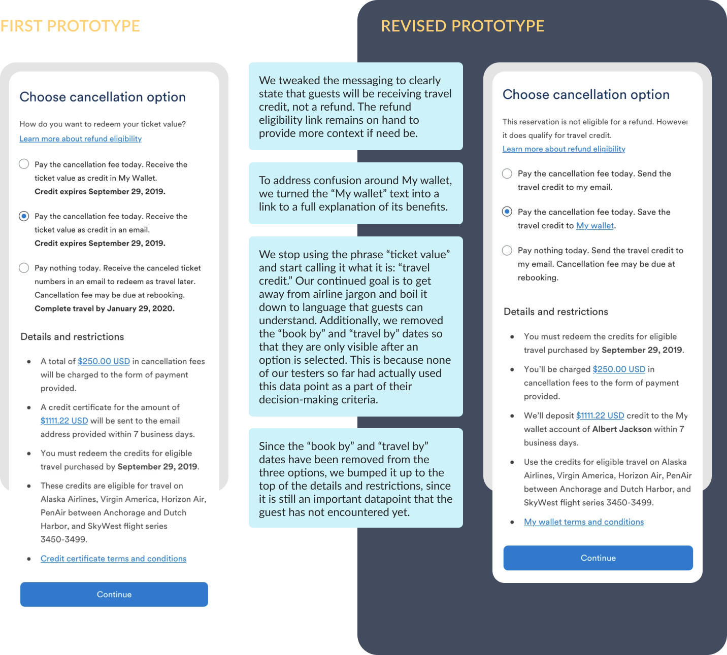
It was time to rework the our prototype for another round of user testing. Here are our revisions, based off our first round of user testing feedback. The revised prototype is on the right:

User Testing - Round 2
After adjusting the prototype, we went back for a second round of unmoderated testing. Here's our revised prototype in clickable format:
After adjusting our prototype, we went back for a second round of unmoderated testing. You can see the prototype here.
In this second loop, our goal was to test if participants recognized they would be receiving credit instead of a full refund. As before, we also made sure to test their understanding of the three cancellation options overall. Here's our feedback:
- 9/10 participants recognized that they would be receiving travel credit, not a refund.
- 8/10 participants understood what "My wallet" was as a cancellation option.
- 8/10 participants felt their expectations were met or exceeded on the confirmation page.
Participants that had canceled recently:
- Overall experience canceling: 4.8 / 5
"This is a pretty straightforward process...no questions, really." - Refund option explanations: 4.5 / 5
"Options were explained clearly...confirmation screen made it a little more reassuring." - Confidence in their understanding of the options: 4.5 / 5
"I feel like I understand clearly what is going to happen."
Participants that had not canceled recently:
- Overall experience canceling: 4.5 / 5
"Really couldn't mess it up. Felt like I was getting all the information." - Refund option explanations: 4.5 / 5
"I'm never 100%...but this felt pretty good." - Confidence in their understanding of the options: 4.5 / 5
"Very easy...nothing that really caused me to have to think."
Here are our rating scale questions again, side-by-side with our previous ratings.

Amongst both participant groups, our revised cancellation options scored significantly higher than in the first prototype, even slightly edging out the original experience. In addition, the overall experience rating maintained at a high level. With this promising feedback, we felt ready to translate our designs to desktop and deliver on our MVP.
